Pantone Colour of the Year 2017 – Springtime Hues
Pantone’s Colour of the Year 2017 is a popular topic across the creative, design and wedding planning communities. Our luxury wedding planners will look to this wedding trends for inspiration throughout the year. Here is how we feel it will feature.
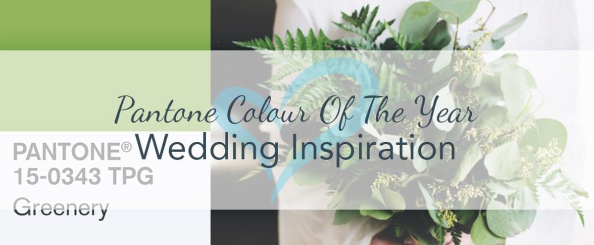
Winter will soon be behind us as we move towards spring. Pantones hot new colour trend is Greenery, with new fab colours of Primrose Yellow, Pale Dogwood, Hazelnut, Island Paradise.
When preparing for your wedding, particularly when you are unsure about which colours to choose, lighter colours are fresher and romantic, whereas darker ones are more formal and classic, but by combining different colour tones, you will set the atmosphere for your whole wedding day.

Credits: Thanasis Skourlis, HollyPhillips@TheEnglishRoom, Kim Nowell Photography
Mixing Greenery, Hazelnut and Kale will make a serene springtime wedding perfect with these earthy palettes and will harmonise a rustic ceremony complete with foliage and woody accentuates.
Greenery is a piquant yellow green and befits its name; Kale is dark green and enhances the palette with a deeper colouring. Bring the palette collectively together with Hazelnut, an adaptable colour that infuses natural warmness.
The palette will pop when you add a cheeky shade of Flame, Pink Yarrow or Lapis Blue as the leading colour.

Credits: Al’s Florist, Stylish Wedd, Carly Bevan Photography
Wedding trends are motivated by a varied array of influences from interior and graphic design to fashion. Past inspirations have been geometric shapes, ombré styling and not to forget carnival.
So it’s not unexpected that Pantone’s colour choice on seasonal looks greatly impacts wedding trends.